Phoenix Writers’ Circle
BRAND IDENTITY
As a member of this warm and welcoming writers’ group, this ongoing project remains close to my heart(h).

Essence of the Phoenix: persevering creation.
Phoenix Writers’ Circle needed a warm visual identity for a fresh era.
What do passionate writers and this legendary creature share in common?
A gently-smouldering, everlasting fire in the belly… and perhaps a generous dose of grit, too.
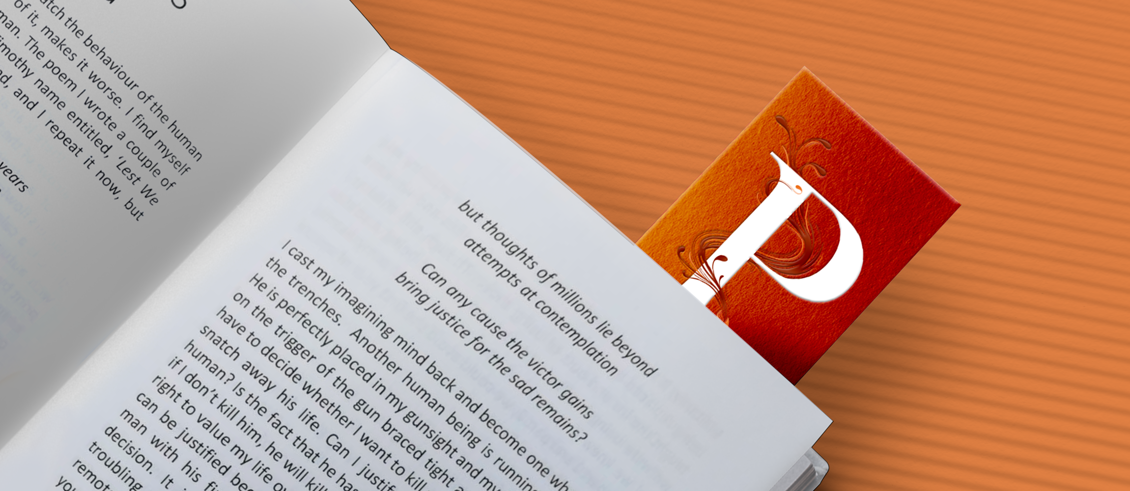
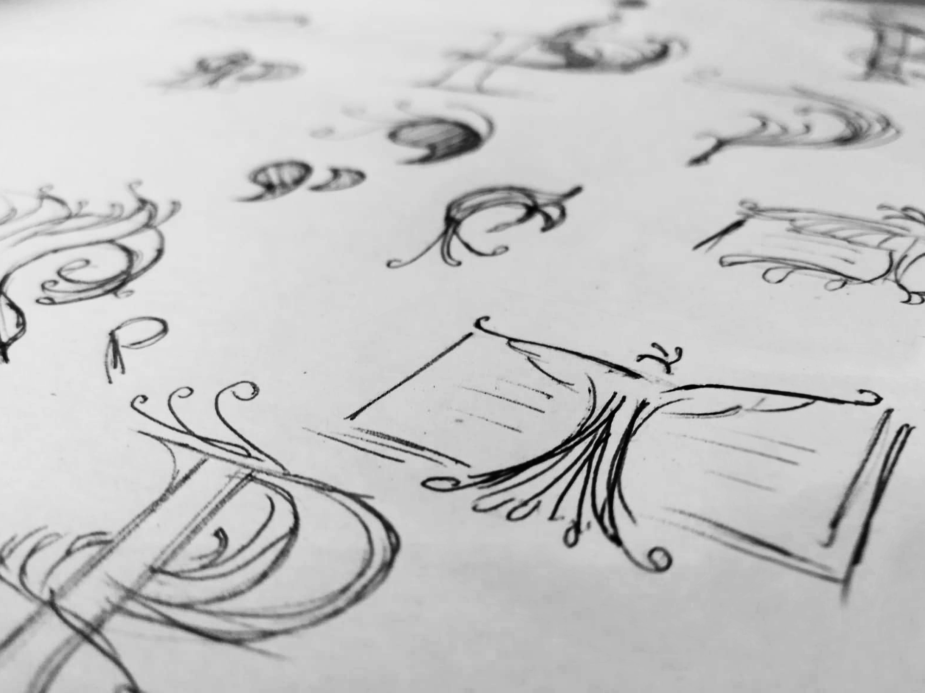
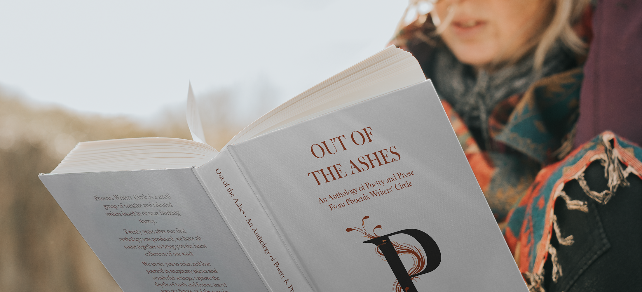
To illustrate these qualities in a fresh and literary-esque way, I created a logo within which phoenix quill and typed letter entwine together. The wrap-around nature of the quill highlights the organic process of writing, and I was very keen to express movement and life here to get our creative passion across.
A touch of bronze compliments the main colour (rust) and alludes a little to the priceless worth of the written word - each drop of the ink is precious.
This logo for Phoenix Writers Circle birthed alongside a new cycle in the group’s journey, and is the first to work robustly across both print and online material.
Just my type:
Phoenix Writers’ Circle is named as such due to its many rebirths in the group’s 35 year history.
Baskerville Old Face works well as the typeface used for the ‘P’ to bring a little modern heritage - it’s a beautiful, well-balanced font complimentary to the silky curves of the illustrated quill.


Phoenix Writer’s Group has risen again in recent years, with a new visual identity and online presence.
Since launching, the logo has been received extremely well and features on the cover of our debut anthology, ‘Out of the Ashes’, released October 2021.
“Rosie brought us her very talented skills as an artist and helped us enormously with our logo. She so cleverly encapsulated the name of our group with its theme and our raison d’etre, as well as creating a striking and attractive logo.”
— Justine, current Chairperson of Phoenix Writer’s Circle